WELLCOME BACK
H
ello guys. How are you all? I hope you are all well. I came again with a post. Let’s go..
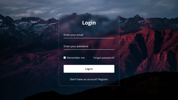
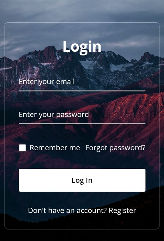
তো এই পোস্টে শেয়ার করবো সুন্দর একটি Login Form ডিজাইন। যা Glassmorphism Form। তো চলুন শুরু করা যাক।
Live Demo
Code
সব কোড একসাথে .html এ Download করুন।
index.html
<!DOCTYPE html>
<html>
<head>
  <meta charset="UTF-8">
  <meta name="viewport" content="width=device-width, initial-scale=1.0">
  <title>Glassmorphism Login Form </title>
  <link rel="stylesheet" href="style.css">
</head>
<body>
  <div class="wrapper">
    <form action="#">
      <h2>Login</h2>
        <div class="input-field">
        <input type="text" required>
        <label>Enter your email</label>
      </div>
      <div class="input-field">
        <input type="password" required>
        <label>Enter your password</label>
      </div>
      <div class="forget">
        <label for="remember">
          <input type="checkbox" id="remember">
          <p>Remember me</p>
        </label>
        <a href="#">Forgot password?</a>
      </div>
      <button type="submit">Log In</button>
      <div class="register">
        <p>Don't have an account? <a href="#">Register</a></p>
      </div>
    </form>
  </div>
</body>
</html>
style.css
@import url("https://fonts.googleapis.com/css2?family=Open+Sans:wght@200;300;400;500;600;700&display=swap"); * { margin: 0; padding: 0; box-sizing: border-box; font-family: "Open Sans", sans-serif; } body { display: flex; align-items: center; justify-content: center; min-height: 100vh; width: 100%; padding: 0 10px; } body::before { content: ""; position: absolute; width: 100%; height: 100%; background: url("login-hero-bg.jpg"), #000; background-position: center; background-size: cover; } .wrapper { width: 400px; border-radius: 8px; padding: 30px; text-align: center; border: 1px solid rgba(255, 255, 255, 0.5); backdrop-filter: blur(8px); -webkit-backdrop-filter: blur(8px); } form { display: flex; flex-direction: column; } h2 { font-size: 2rem; margin-bottom: 20px; color: #fff; } .input-field { position: relative; border-bottom: 2px solid #ccc; margin: 15px 0; } .input-field label { position: absolute; top: 50%; left: 0; transform: translateY(-50%); color: #fff; font-size: 16px; pointer-events: none; transition: 0.15s ease; } .input-field input { width: 100%; height: 40px; background: transparent; border: none; outline: none; font-size: 16px; color: #fff; } .input-field input:focus~label, .input-field input:valid~label { font-size: 0.8rem; top: 10px; transform: translateY(-120%); } .forget { display: flex; align-items: center; justify-content: space-between; margin: 25px 0 35px 0; color: #fff; } #remember { accent-color: #fff; } .forget label { display: flex; align-items: center; } .forget label p { margin-left: 8px; } .wrapper a { color: #efefef; text-decoration: none; } .wrapper a:hover { text-decoration: underline; } button { background: #fff; color: #000; font-weight: 600; border: none; padding: 12px 20px; cursor: pointer; border-radius: 3px; font-size: 16px; border: 2px solid transparent; transition: 0.3s ease; } button:hover { color: #fff; border-color: #fff; background: rgba(255, 255, 255, 0.15); } .register { text-align: center; margin-top: 30px; color: #fff; }
আমি সব সময় কোডিং বিষয়ক পোস্ট করি তাই কোডিং নিয়ে কোনো কিছু লাগলে কমেন্ট এ বলবেন।
THE END
S
o friends, that’s it for today. See you in another post. If you like the post then like and comment. Stay tuned to Trickbd.com for any updates.
The post আপনার ওয়েবসাইটের জন্য Glassmorphism Login Form তৈরি করুন appeared first on Trickbd.com.
from Trickbd.com https://ift.tt/xQkrTJS
via IFTTT


No comments:
Post a Comment